Pinterest Joins the Color Forecast for 2026 with Its Own Colors of the Year
Following early declarations from Pantone and WGSN, Pinterest unveils a data-backed palette that reflects how people are actually using color today.
Following the early announcements from global color authorities—like Pantone, which named Cloud Dancer as its Color of the Year 2026; and WGSN, which highlighted Transformative Teal as a defining shade—Pinterest has also unveiled its own take, featuring a suite of five dynamic colors drawn from real-time user search behavior.
Dubbed the Pinterest Palette 2026, the platform’s forecast departs from the traditional single-shade proclamation. Instead, Pinterest presents five distinct colors—Cool Blue, Jade, Plum Noir, Wasabi, and Persimmon—each rooted in global search and save behavior from its community of over 600 million monthly users. The result is a more fragmented yet telling snapshot of how people are engaging with color today.
Pinterest Drops Its 2026 Colors of the Year
While Pantone’s annual reveal typically centers on one defining hue meant to capture the cultural mood, and WGSN’s forecast reflects macro-level shifts across industries, Pinterest’s palette offers something more immediate. Its selections are drawn directly from what users are actively planning, curating, and aspiring toward—making the 2026 palette less prescriptive and more reflective of real-time desire.
According to Pinterest, the colors point to a growing appetite for expression and experimentation, signaling a move away from years of muted minimalism. Instead, 2026 is shaping up to be about contrast: calm tones alongside charged ones, softness meeting bold intent.
The Five Colors That Will Shape 2026, According to Pinterest
Cool Blue
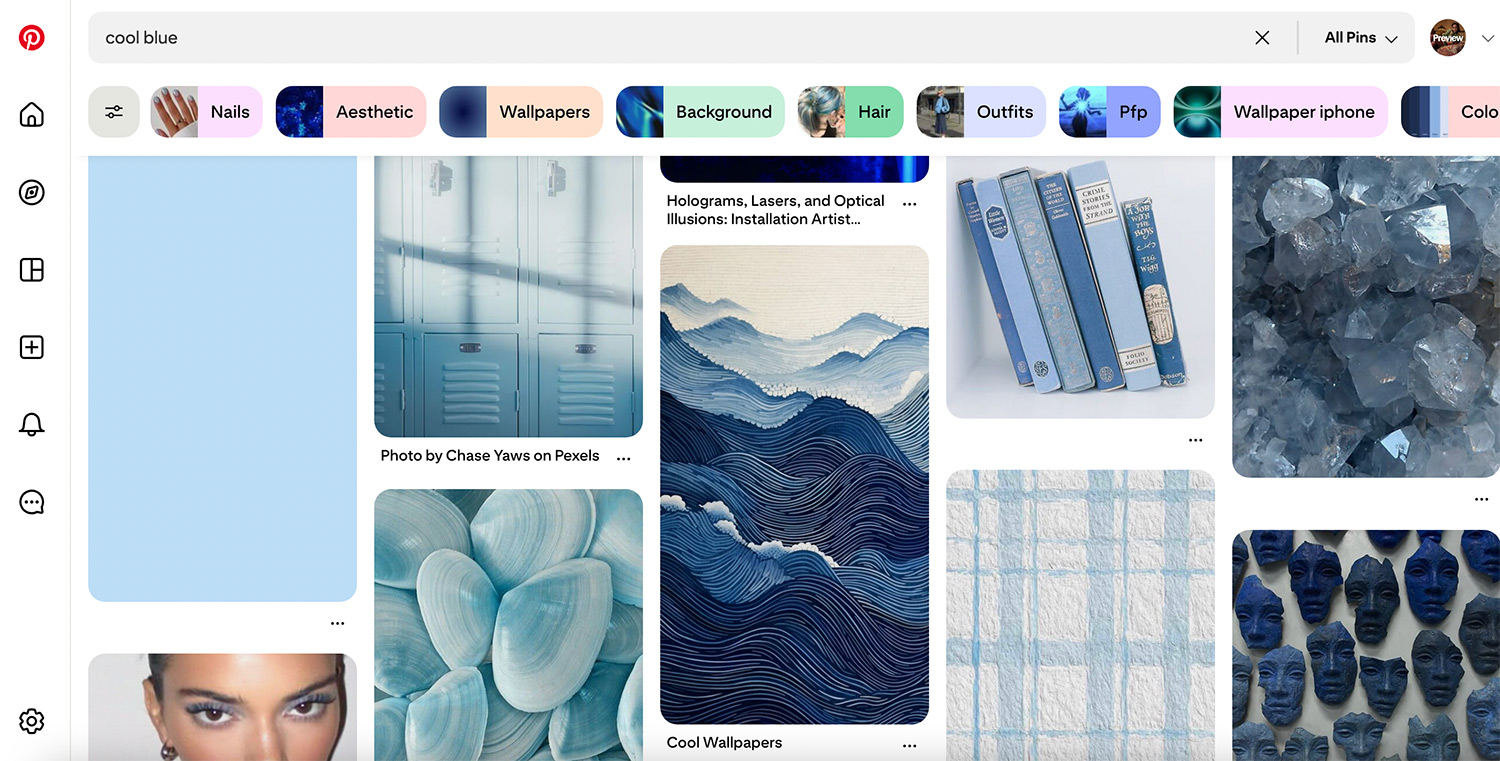
An icy, glacial shade that feels crisp and restorative, Cool Blue emerges as Pinterest’s hero tone for 2026. Searches for “cool blue” rose by 85 percent year-on-year, underscoring the growing appetite for colors that signal calm, clarity, and emotional reset. In fashion, the shade is already appearing in fluid tailoring, knitwear, and accessories, positioning itself as a modern neutral with a distinctly cool edge.
Jade
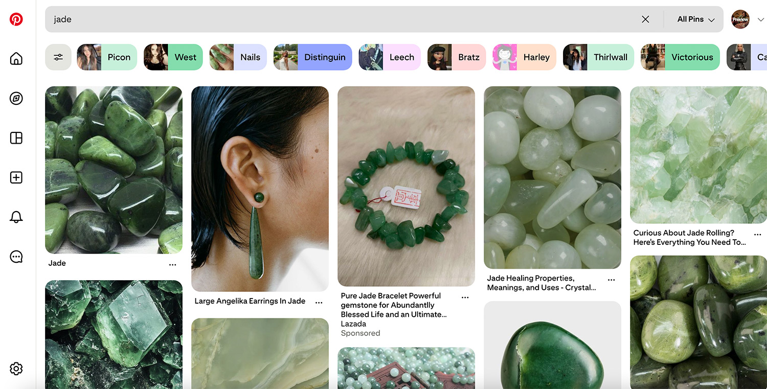
Soft yet grounded, Jade sits between mint and moss, echoing the continued rise of biophilic design and nature-driven aesthetics. Searches for jade-inspired textures, accessories, and finishes saw significant growth, reinforcing its appeal as a versatile tone that works seamlessly across fashion, beauty, and interiors.
Plum Noir
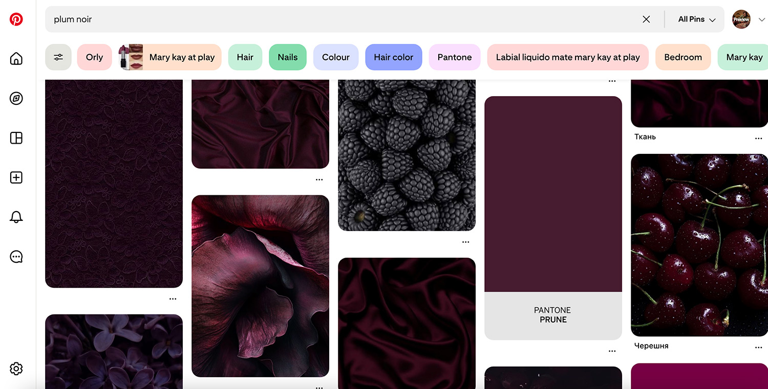
Deep, moody, and richly layered, Plum Noir reflects the return of maximalist sensibilities. With search interest for dark plum and burgundy tones surging, the shade captures the collective craving for drama, depth, and emotional intensity—particularly within eveningwear, beauty looks, and statement accessories.
Wasabi
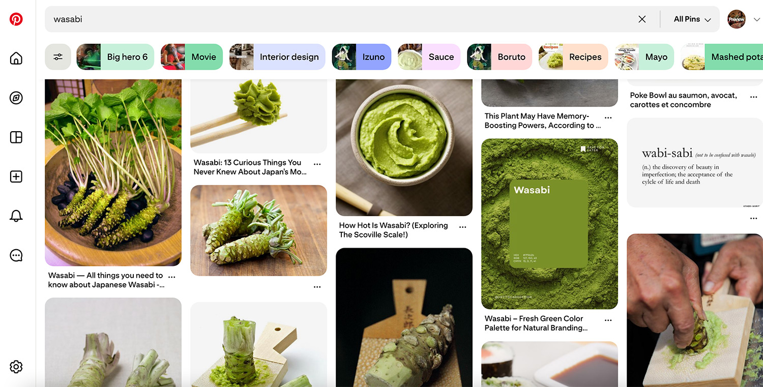
Electric and unapologetically bold, Wasabi is Pinterest’s most provocative pick. This chartreuse-green hue speaks directly to Gen Z’s appetite for high-impact visuals and experimental self-expression, dominating searches across fashion styling, weddings, and graphic design.
Persimmon
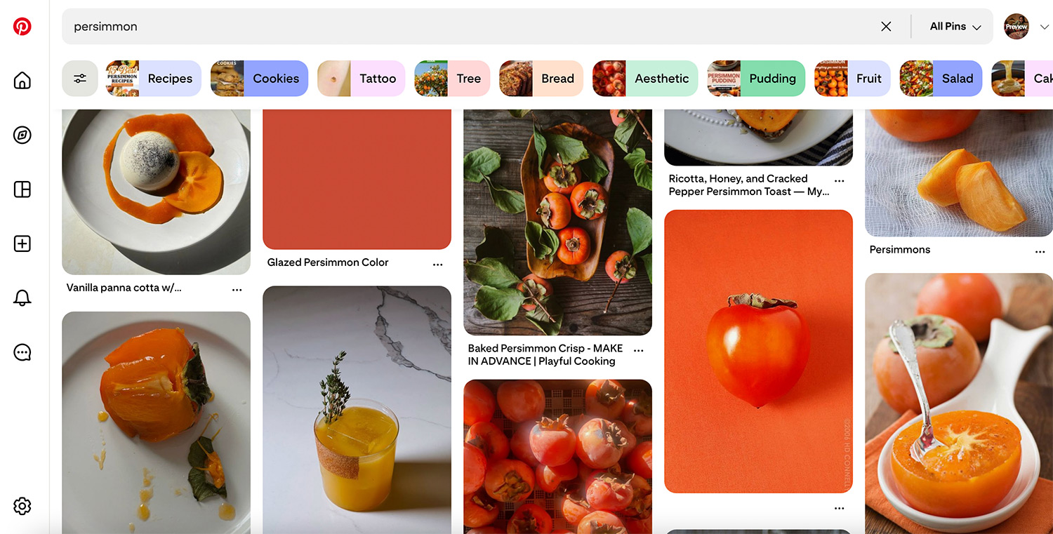
A vibrant red-orange with undeniable warmth, Persimmon taps into the renewed popularity of fiery, energetic tones. With strong growth in searches for orange color pairings and statement dressing, the shade reflects fashion’s ongoing flirtation with optimism and visual confidence.
