Let There Be Color
From film and architecture to fashion and makeup, our preference for neutrality has reshaped how we express ourselves. Perhaps it's time we embrace color once again.
by Kyla Villena
Published on Jul 31, 2026
Neutrals occupy a gray area. Colors have long been shown to influence mood, emotion, and behavior, but the psychological effects of neutral hues are often less defined. They can feel calming to some, yet uninspiring to others. White may evoke purity or indifference, while black can suggest mystery or sophistication. Existing between opposing ends of the spectrum, neutrals often feel safe, inviting little debate or strong reaction.
Beyond color, neutrality has also come to signify quietness. It leaves room for interpretation, neither affirming nor denying how one truly feels. There are many reasons people choose neutrality: a desire to avoid conflict, uncertainty, or the absence of a firm position. At times, it can reflect a fear of criticism or disruption, making silence the easier option.
Neutrality, in every sense of the word, is ultimately a choice. So when did we begin choosing it? And when did we lose our color?
The World Has Gone Neutral!
The loss of color is reflected across different aspects of our lives. In cinema, for instance, black-and-white films were once the norm until Technicolor emerged in the early 20th century, ushering in richer, more vibrant color reproduction. It transformed the visual language of filmmaking and forever changed how stories were told on screen.
Today, creatives have more control over color than ever before, yet many contemporary films lean in the opposite direction. Lower contrast, softer highlights, and muted palettes have become defining characteristics of modern cinematography. As digital colorist Hootan Haghshenas told The Guardian, "Even though it can appear effortless, there's usually a huge amount of work behind achieving this kind of naturalistic look, just as much as in more traditional, stylized lighting."
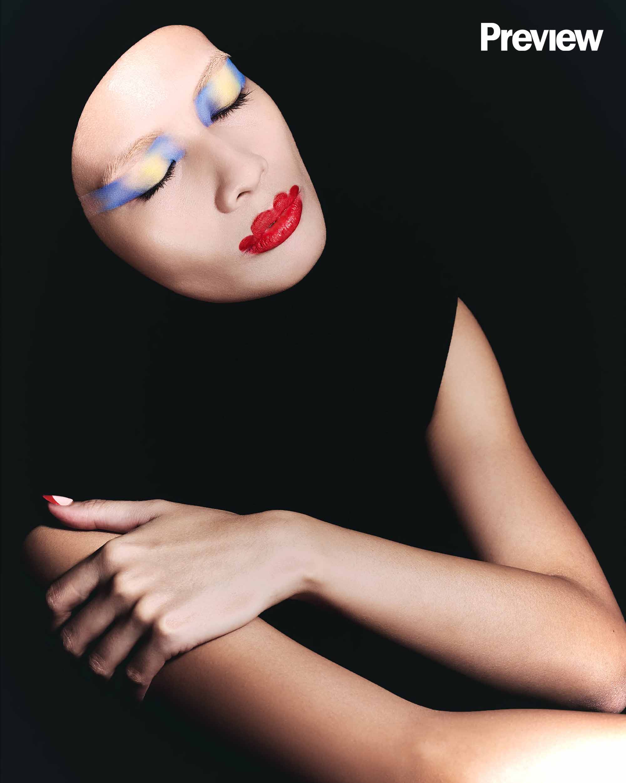
Jon Constantinou, a producer and director, views this as a way to promote "immersion," which he believes is "a trend that kicked up at the dawn of digital, typically [involving] a combination of wider-angle camera lenses, with the cameras being placed closer to the action." The goal is to mirror reality, allowing audiences to rely less on their imagination.
Hootan echoes this sentiment, saying, "Many filmmakers want a visual world that feels grounded, atmospheric, and emotionally truthful. Darker images can add tension, intimacy, and realism."
The preference for muted palettes suggests something beyond aesthetics. Increasingly, realism has become synonymous with restraint—as though the closer something resembles real life, the less color it should contain. Yet the world itself has never been devoid of color. The sky stretches endlessly in shades of blue. Birds flash vibrant plumage overhead. Trees flourish in lush greens, while flowers bloom in brilliant hues. Nature remains unapologetically vivid. It is in the environments we build and the choices we make that color often begins to recede.
Centuries ago, Baroque architecture introduced an ornate and elaborate style of art. Many years later, Art Deco followed, embracing bold, deep, and rich colors through geometric forms and decorative motifs. Then came the devastating World Wars, the remnants of which can still be seen in many of the buildings that surround us today.
Brutalism, for example, has its own charm, but it emerged after World War II as part of a broader societal shift. Mark Bittoni, principal and founder of Bittoni Architects, explains to Architectural Digest, "It emerged as a rejection of decorative and ornamental architecture, instead focusing on simplicity and showcasing the honest expression of materials." He acknowledges that this may be the reason behind the style's perceived "darkness" or "coldness."
The same can be said of our homes. They are rarely painted in vivid colors today, while striking interior pieces are often referred to as accents—elements designed to stand out rather than blend in.
Fashion is no exception. Monochromatic looks are often regarded as effortless and timeless. On the other hand, outfits that pair prints with more prints or embrace color-blocking techniques tend to invite more divisive opinions. Occasional pops of color are celebrated as sartorial statements, but an abundance of them can quickly make a look seem like an outlier—one that requires the bravery to stand apart.
Suffice it to say, the world began losing its color when we started making choices with the intention of appealing to others—to make them feel more comfortable, to make things easier and simpler, often at the expense of our own individual expression. What do we want others to feel? What emotions do we hope to evoke? How do we want others to treat us? And ultimately, how do we want to be perceived?
A Colorful Coexistence
Children's imagination allows them to fill coloring books without fear or hesitation. Houses can be neon pink, while the sun can be a lush lavender. Clouds may be tinted dandelion, and rainbows don't always have to follow ROYGBIV. They let colors spill beyond the black lines of the page, never seeing them as boundaries that restrain their creativity.
It is only as they grow older that they are taught everything—and everyone—must look a certain way. They learn which colors belong where, and when they dare cross those lines, they are often told to tone it down so as not to disturb others. Eventually, this trickles down into how they present themselves to the world.
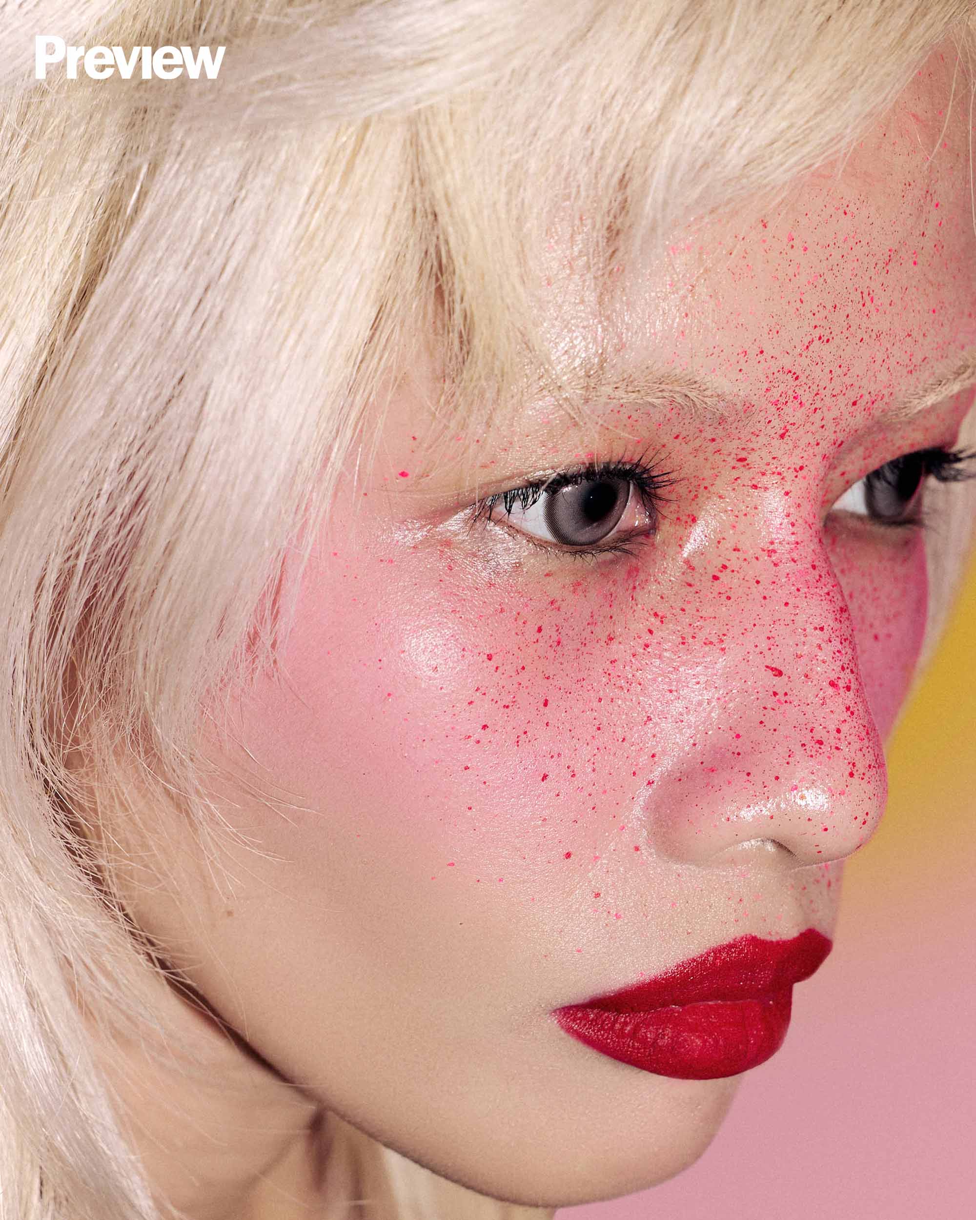
In the past decade, beauty has shifted from bold looks to more understated ones. Long-form beauty tutorials once walked audiences through every step of achieving a smoky eye, a cut crease, or a sharply defined brow. Even while following these tutorials, people were encouraged to make each look their own, fostering a community that was as uplifting as it was unapologetic.
Then came another societal shift, as there often is. Rather than serving solely as a form of self-expression, makeup—or the lack thereof—became a reflection of lifestyle. Influential figures placed a greater emphasis on wellness, blurring the line between skincare and cosmetics. Looking "clean" came to signify a well-rested life and a commitment to self-care.
People reached for their makeup brushes to create looks that appeared almost undetectable, mimicking a natural lift, a healthy flush, or a post-workout glow. Vivid eyeshadows gave way to softer tones, mascara became increasingly optional, and dewy finishes replaced heavier complexions. Lip products, too, gravitated toward shades deemed more "wearable."
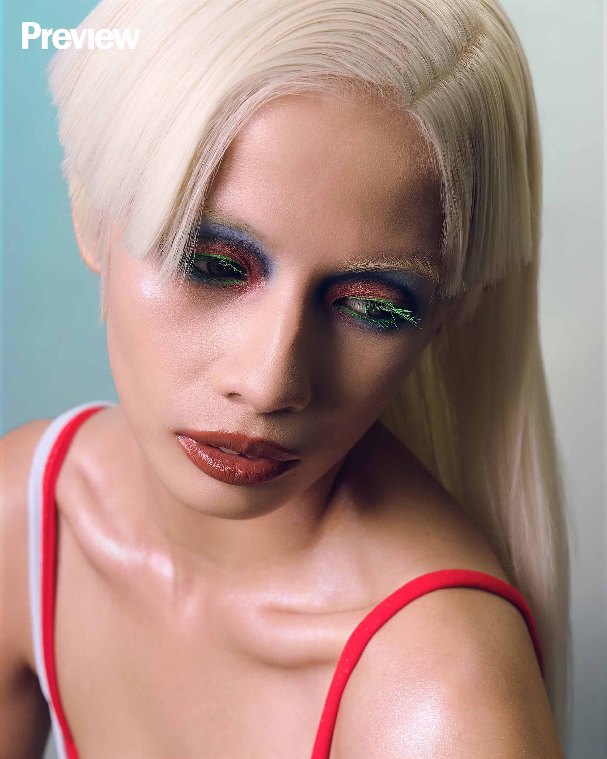
Beauty is largely driven by personal preference, and there is nothing inherently wrong with embracing a minimalist look. That era introduced countless innovations to the beauty industry, and there are important lessons to be learned from it. However, it also blurred the line between effortlessness as an aesthetic and effortlessness as an expectation.
Beauty shifted from an artistic tool to a mask, and people who once spent hours blending an array of colors were now expected to simply blend in.

Putting "natural beauty" at the forefront may encourage people to embrace who they are—or at least, who society thinks they should be. But what if who they truly are is creative, loud, and expressive?
There is an inherent unfairness in treating colorless beauty as a marker of self-care when, for some, it may be the very reason they hide the colors that make them feel most like themselves. Restraint is a choice, and less is more remains an enduring philosophy. But neither should ever be an obligation.
The presence of color was never inherently unprofessional or disrespectful. Those associations were simply decided by people and passed down through generations. Today, it's high time we revisited those assumptions.
Just like art, creative makeup looks are intrinsically personal and put their wearers in a vulnerable position—one that is far removed from the nonchalance often expected of them. They attract attention and, at times, unsolicited opinions. They take hours to create for ourselves, yet only moments for others to tear apart. In many ways, conforming to beauty standards is another act of putting others first. Maybe it's time we turned the tide and put ourselves first instead.
They say neutrals were meant to be safe, but so was beauty. And in that safety, you should have the freedom to be exactly who you are. Beauty is a child's coloring book, where the only rule is to let your imagination run free, unbound by the expectations of others.
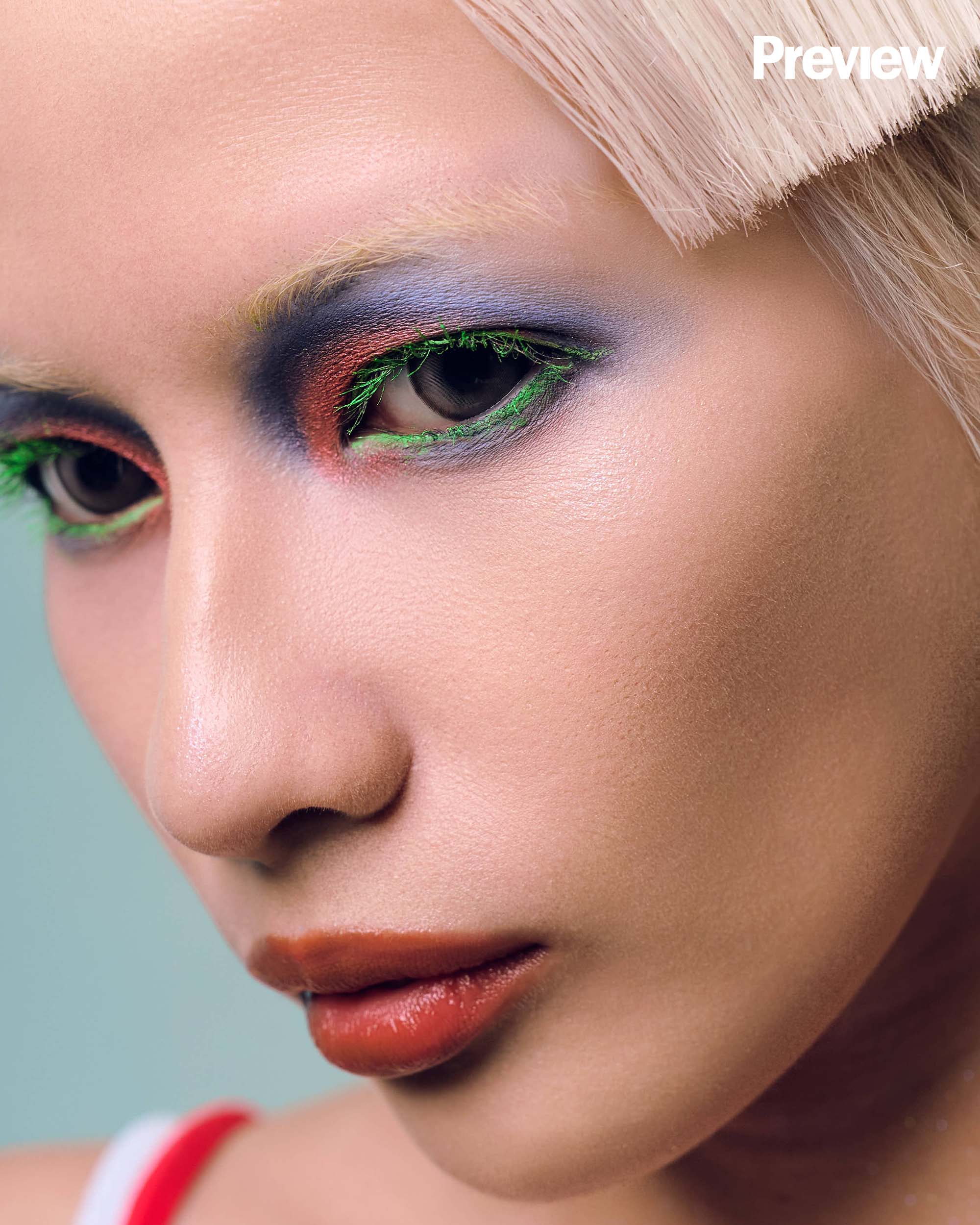
Draw polka dots on your eyelids. Paint your lashes green. Add shimmer to your two-toned lips. It's okay to be different, as long as being different means being yourself.

Produced and Styled by the Preview Team
Editor-in-Chief: Marj Ramos-Clemente
Managing Editor: Reg Rodriguez
Assoc. Creative Director: Jana Jodloman
Producers: Kyla Villena and Paulina Singh
Photographed by Lyka Aluyen. Art direction by Jana Jodloman. Video direction and edit by Bea Felice Panganiban, shot by Teddy Garcia Jr.. Styled by Paulina Singh. Beauty direction by Kyla Villena. Makeup by Angeline Dela Cruz, assisted by Aljon Celis. Hair by Matt Ledesma, assisted by Gabriel Garcia. Nails by Slay Your Nails by Hazel. Story by Kyla Villena. Model: Aijalonica Lei. Photographer’s assistant: Karlo Baylon. Shoot assistants: Kevin Paguntalan and Alfred Locsin.
Kyla Villena loves a good lip gloss and a trip to the art gallery. She is Preview's beauty girl, who doubles as a self-proclaimed motivational speaker.